
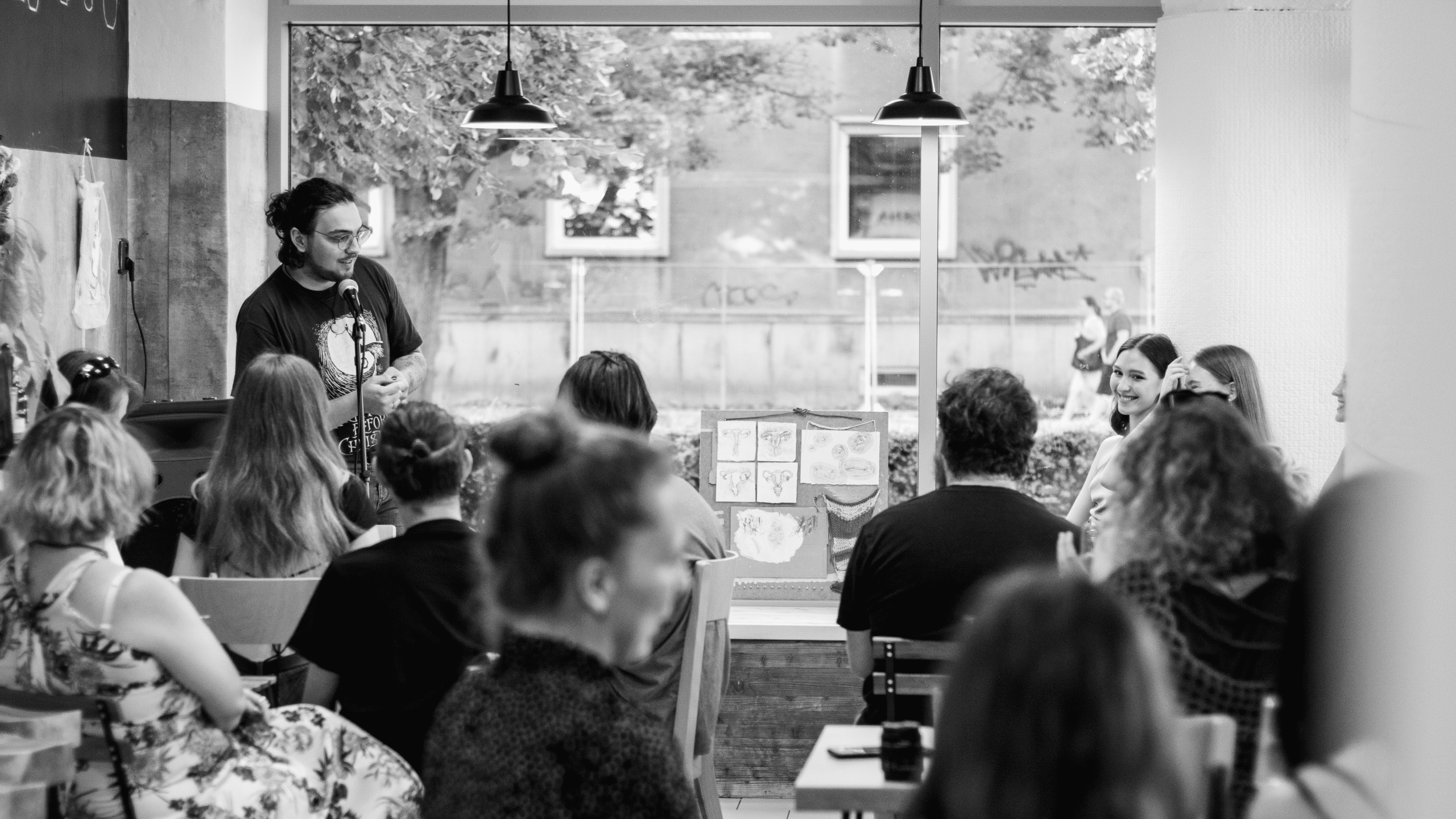
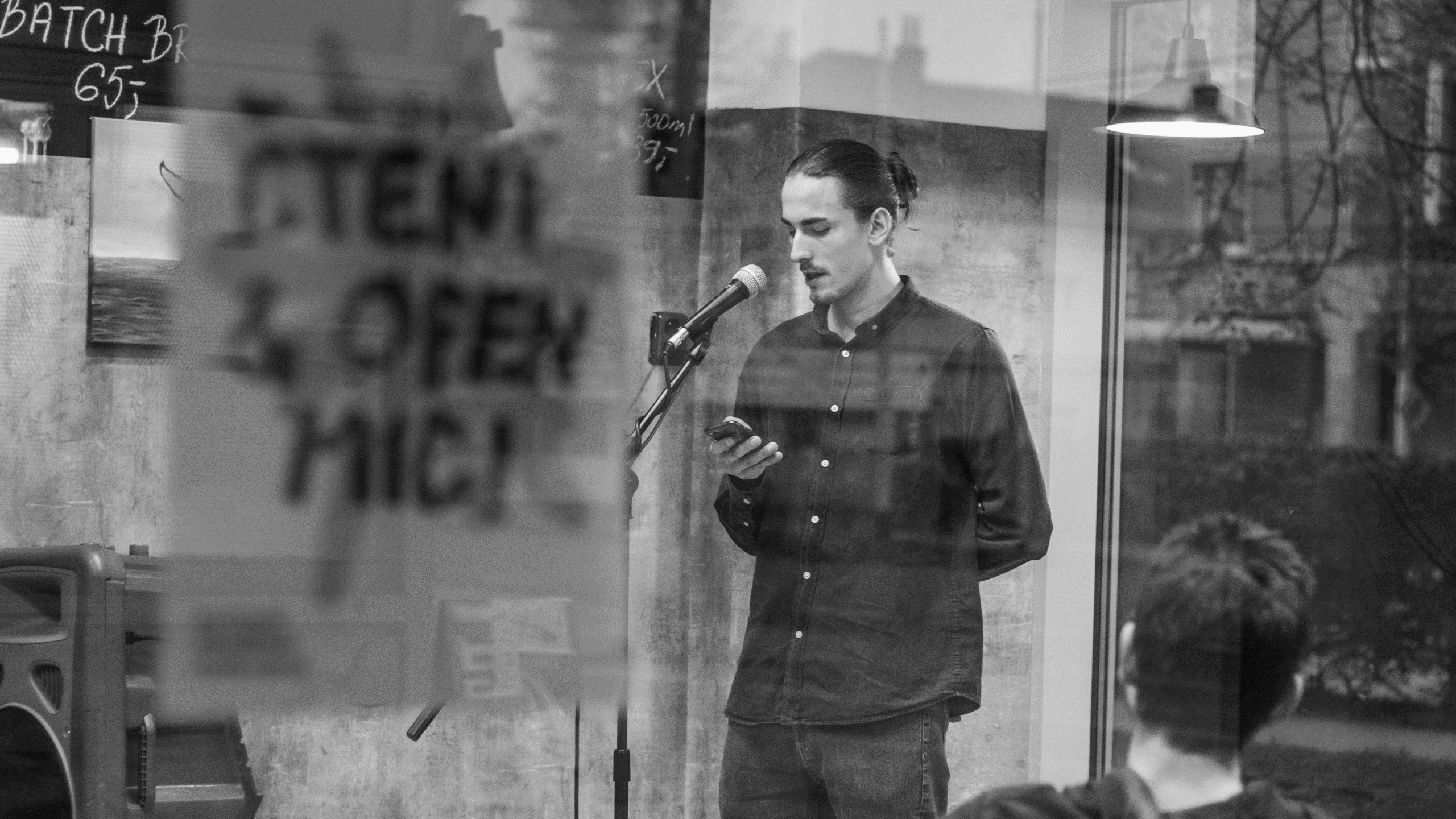
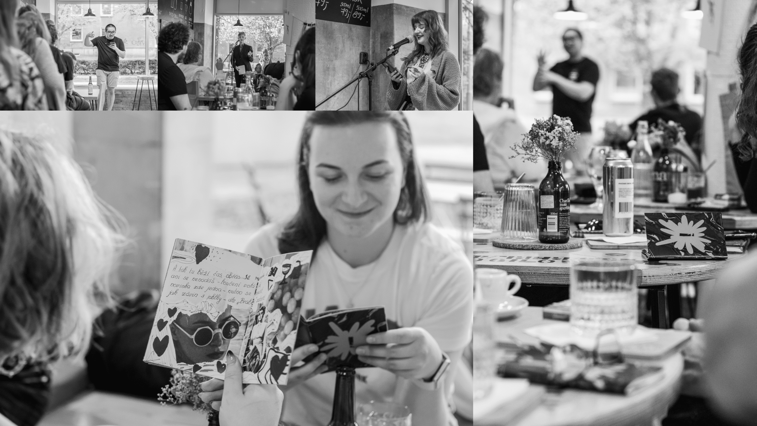
Literature readings, slam poetry exhibitions, workshops and lectures. An open space for exchange, a place to meet. This is what Kulturní šok! (Cultural Shock!) offers. The collective focuses on a bottom-up approach, building community through various small-scale events in the town of Pardubice.
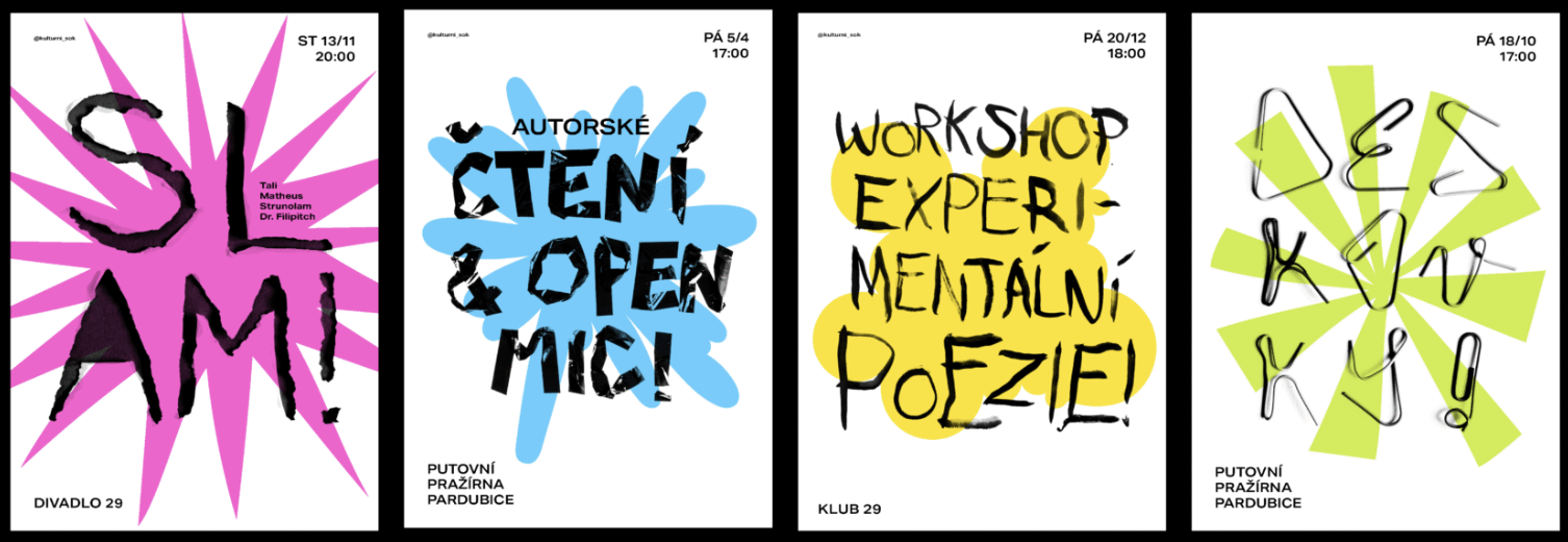
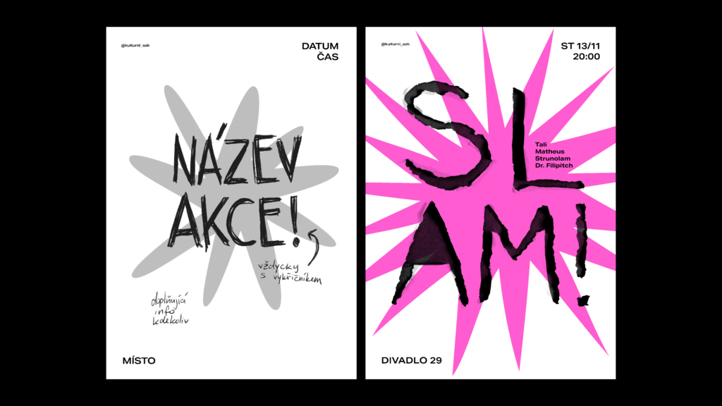
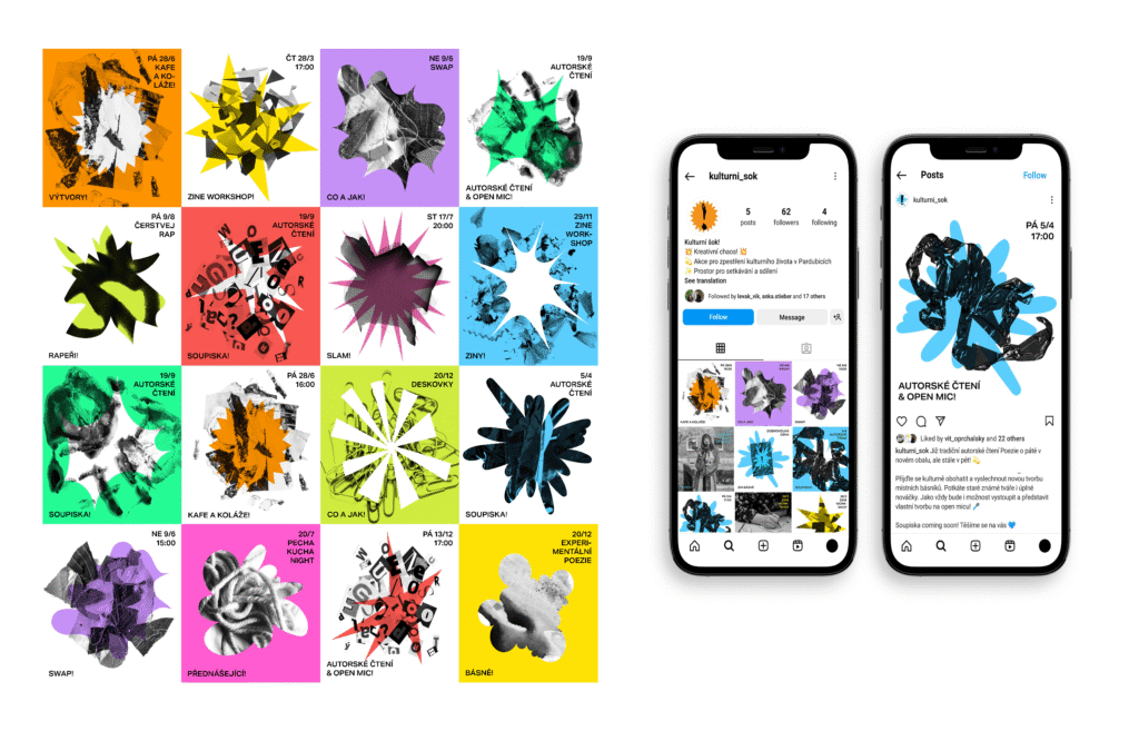
The visual identity of Kulturní Šok! takes heavy inspiration from DIY, as the collective itself is dynamic, creative and a bit rough around the edges. The main goal was to unify the presentation of events so that they were individually recognisable, yet cohesive at the same time.
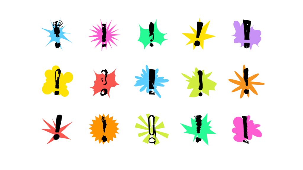
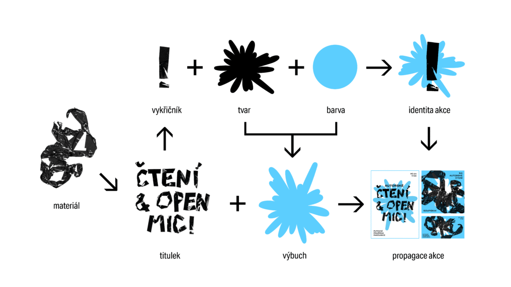
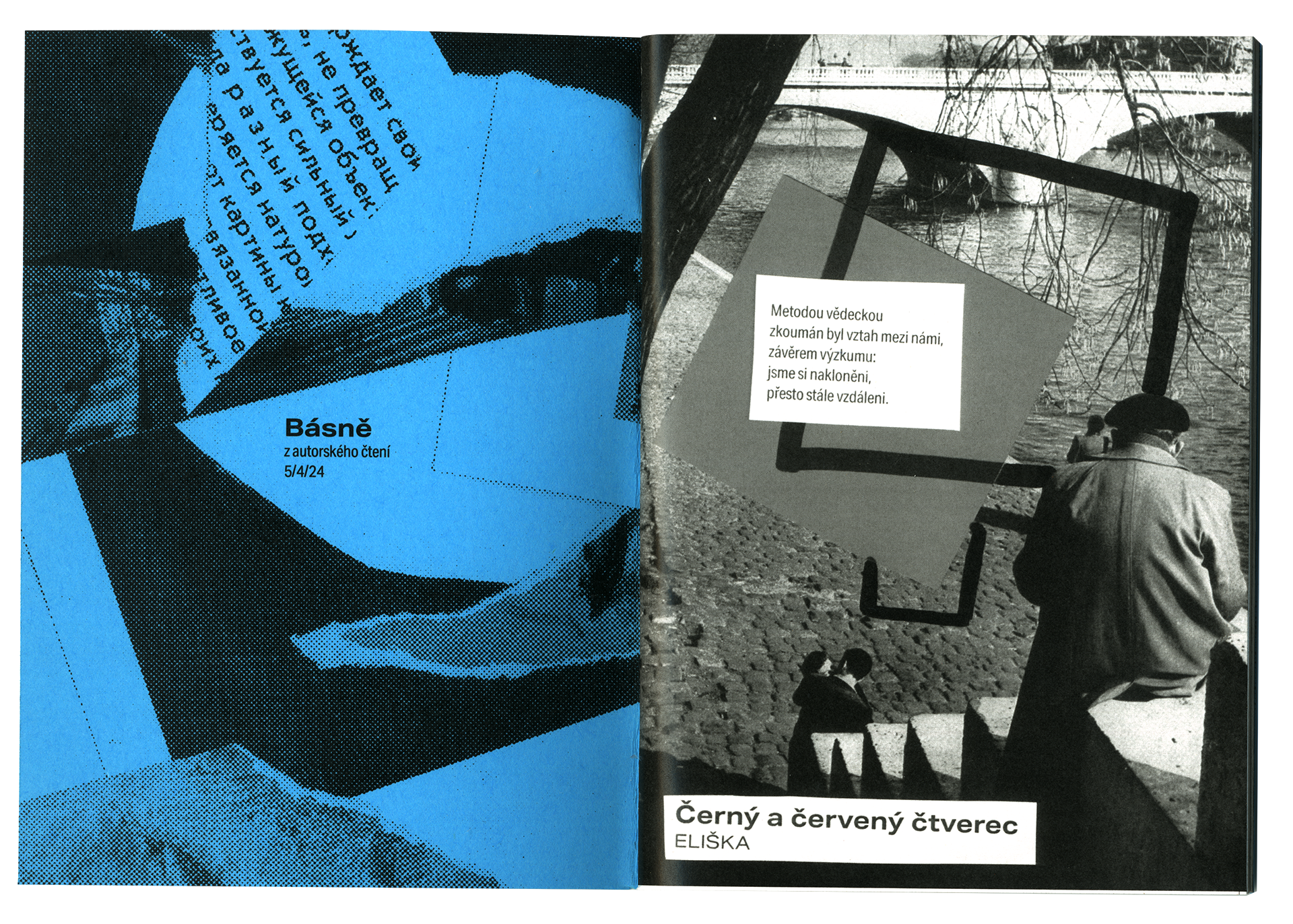
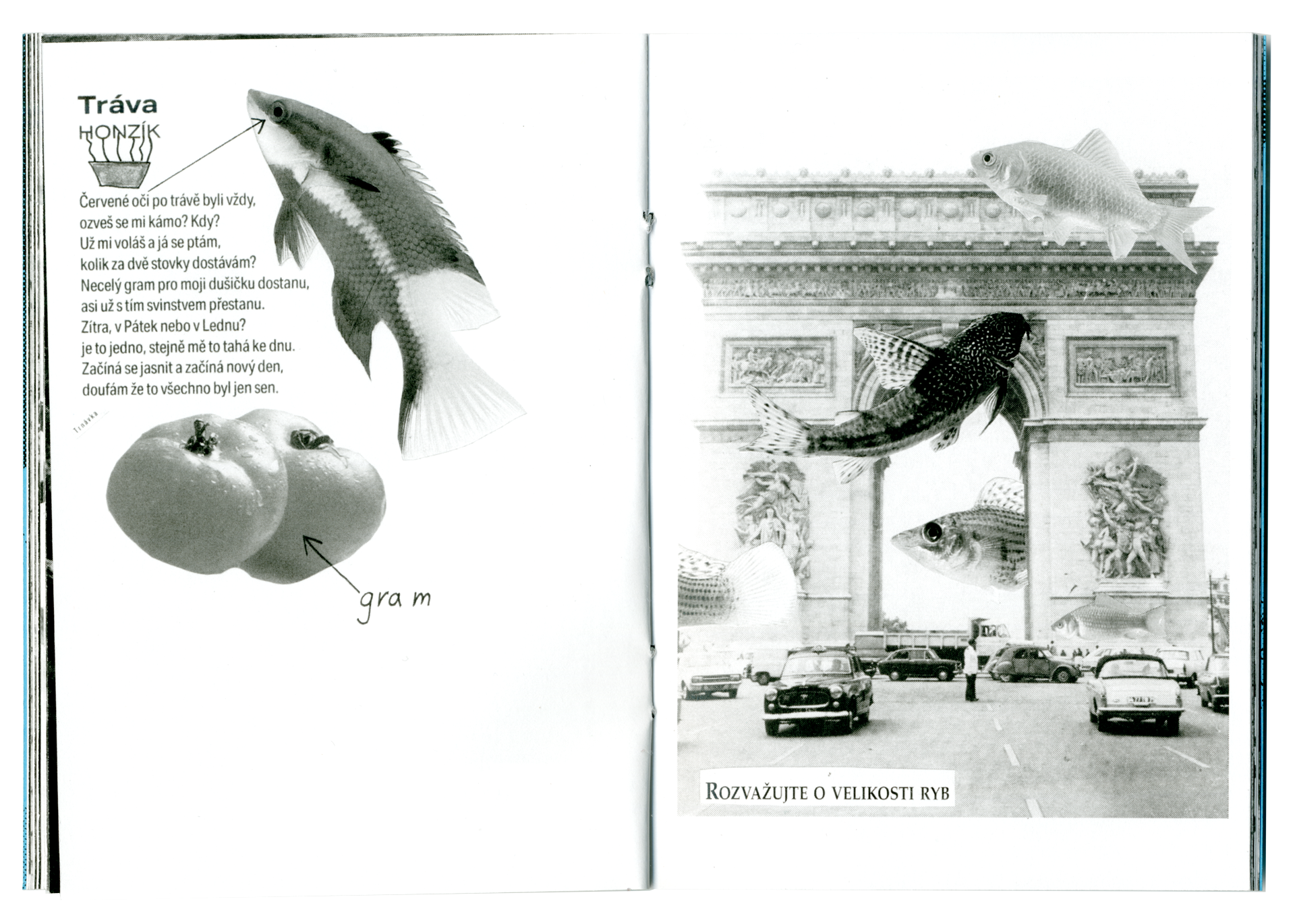
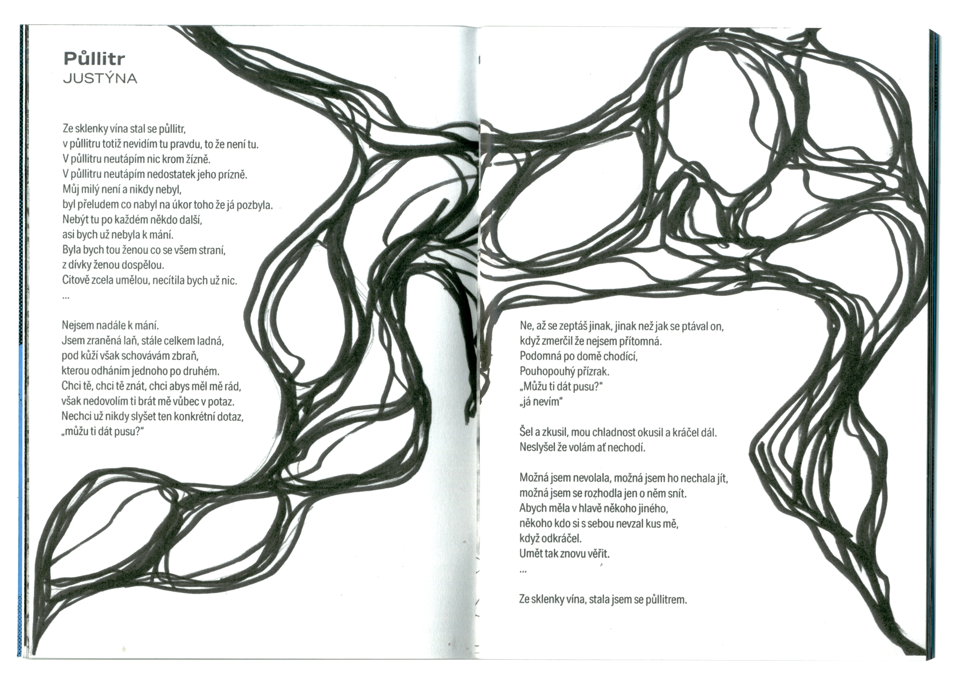
Each event is given three elements – colour, a vector explosion, and an analogue technique through which a title and “material explosion” is created. The logo does not have one specific form or basic variant. It is created by combining a depiction of an explosion supplemented with an exclamation mark in any form.
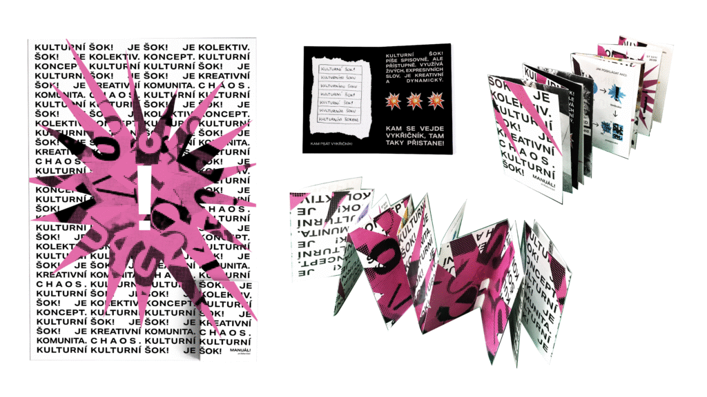
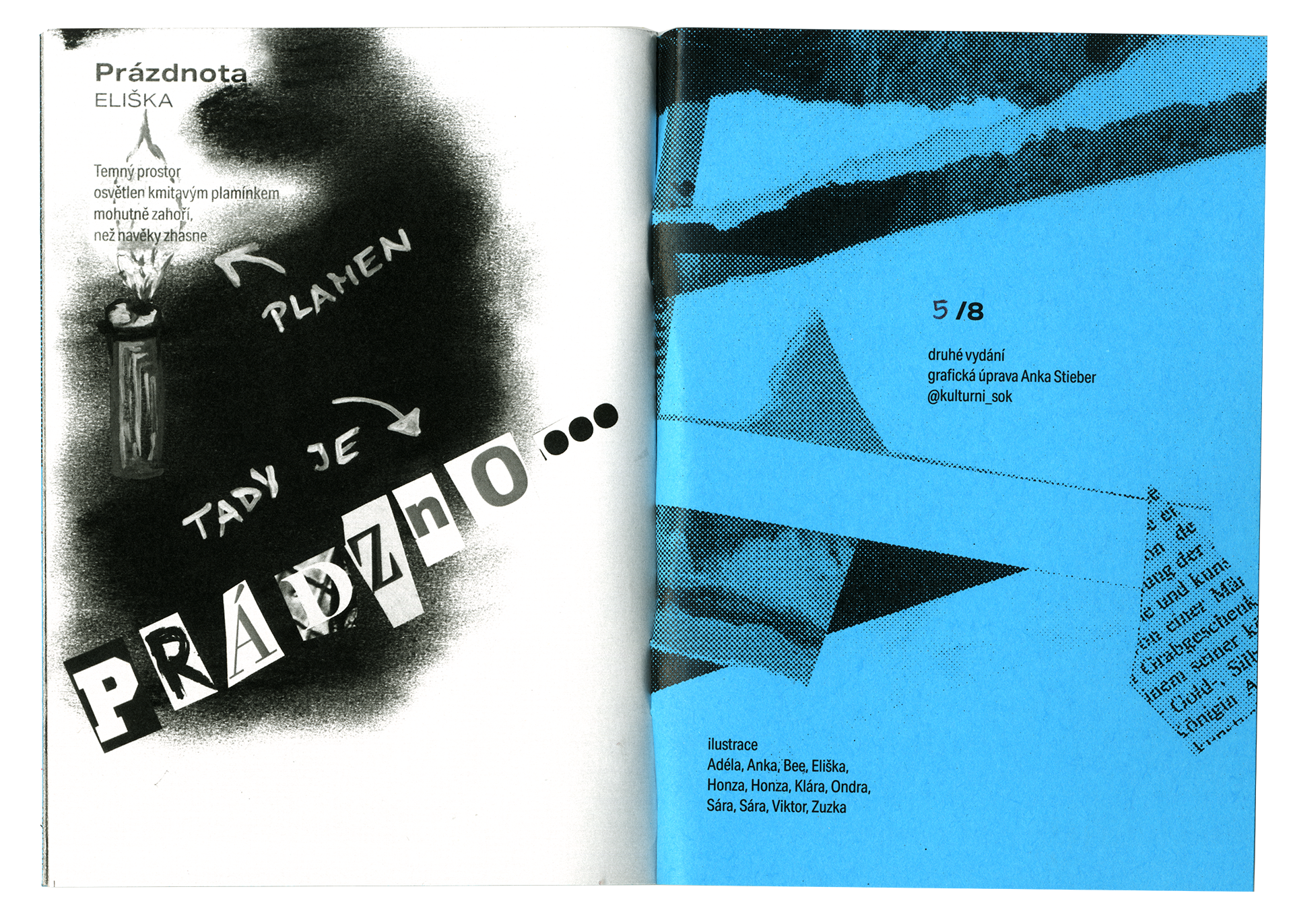
A traditional logo manual did not fit the vibe of the collective, and so the information was transformed into a zine which can be unfolded to reveal a poster.
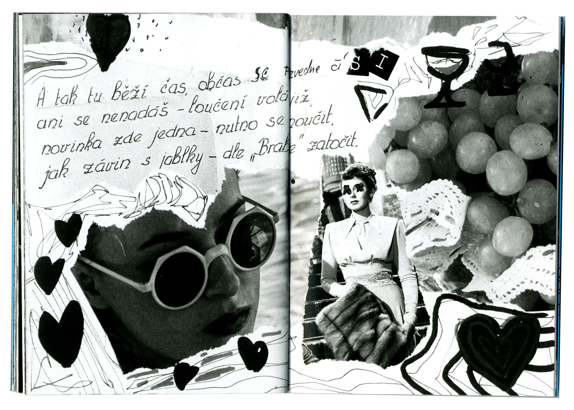
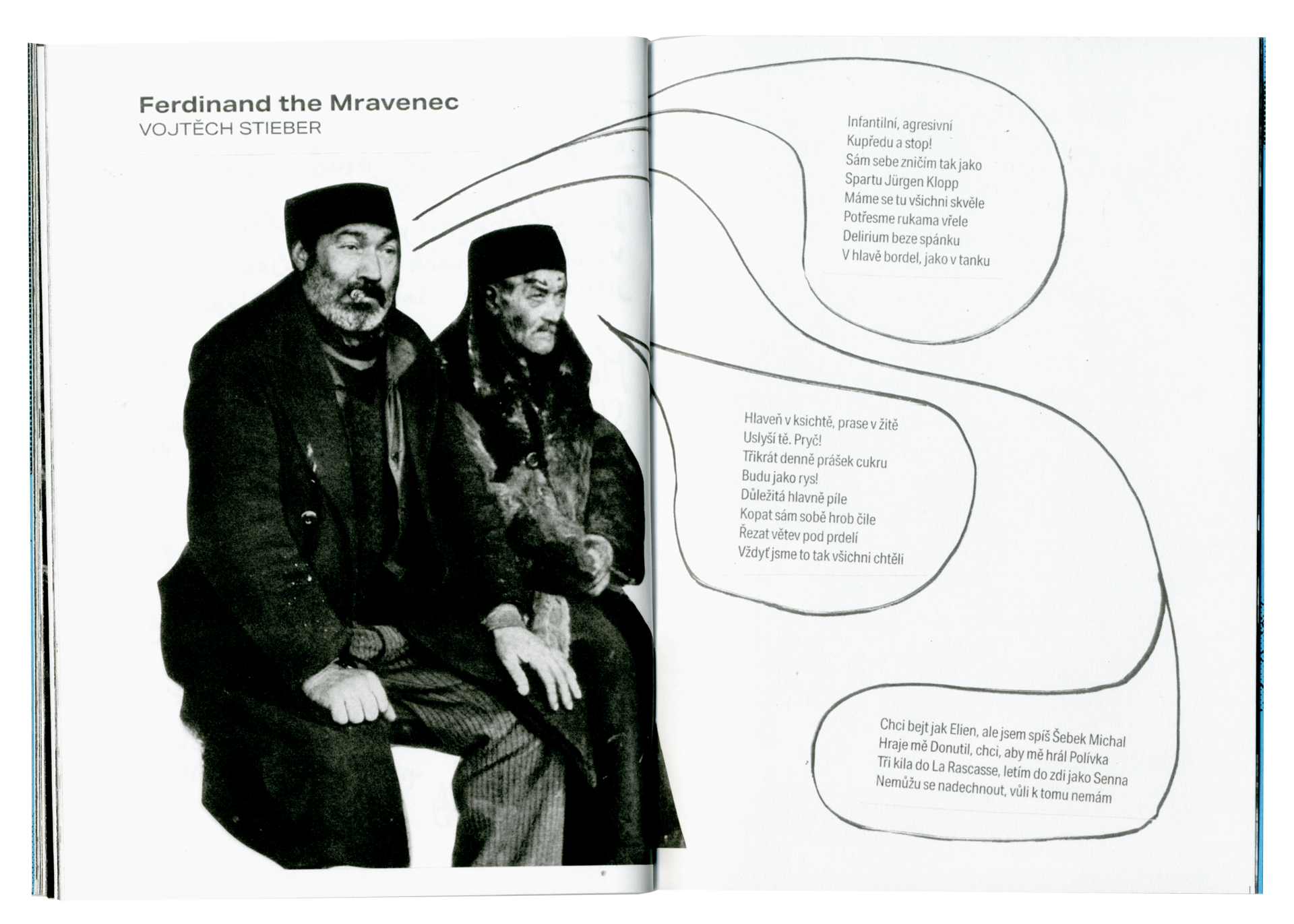
For recurring poetry readings, zines are created at a workshop, including poems and art directly inspired by them. The goal is to create something with the help of the community, something personal, expressive and collaborative, something with added value – the zine does not try to be a perfect brochure, but a direct reflection of the environment and the people who created it.
Fonts used: Akzidenz Grotesk
Made in: Photoshop, Illustrator, InDesign