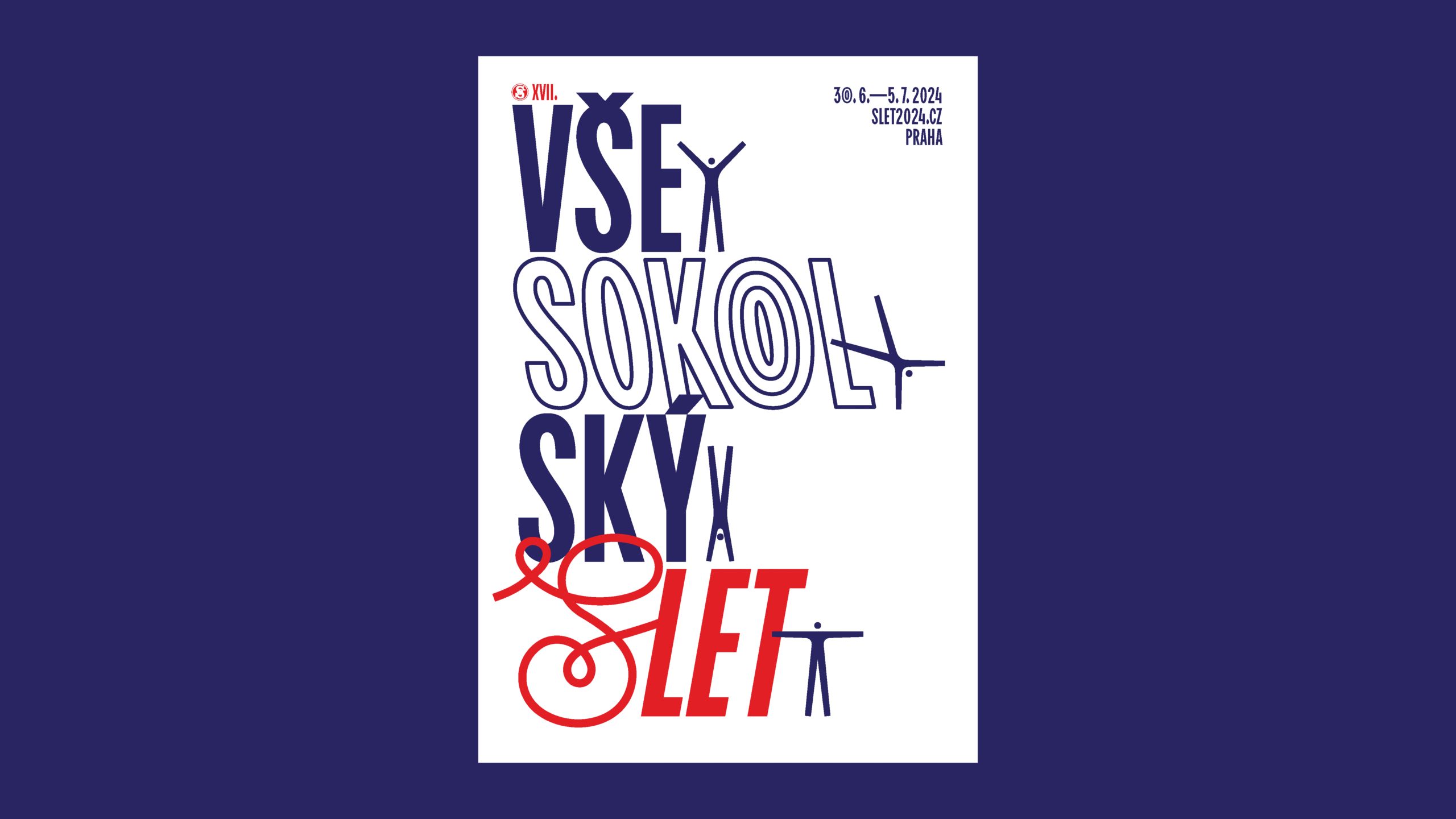
Sokol is a Czech sports organisation with over 100 years of history. “Slet” is a significant event held once every six years in Prague, where hundreds gather to perform synchronised routines. As a class assignment, we were tasked to reimagine the visual identity and wayfinding of the event, encapsulating its essence and history, while presenting it to a modern audience.
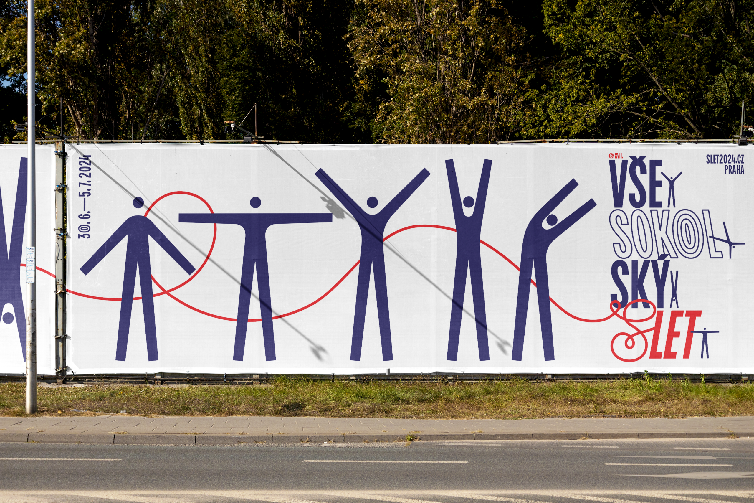
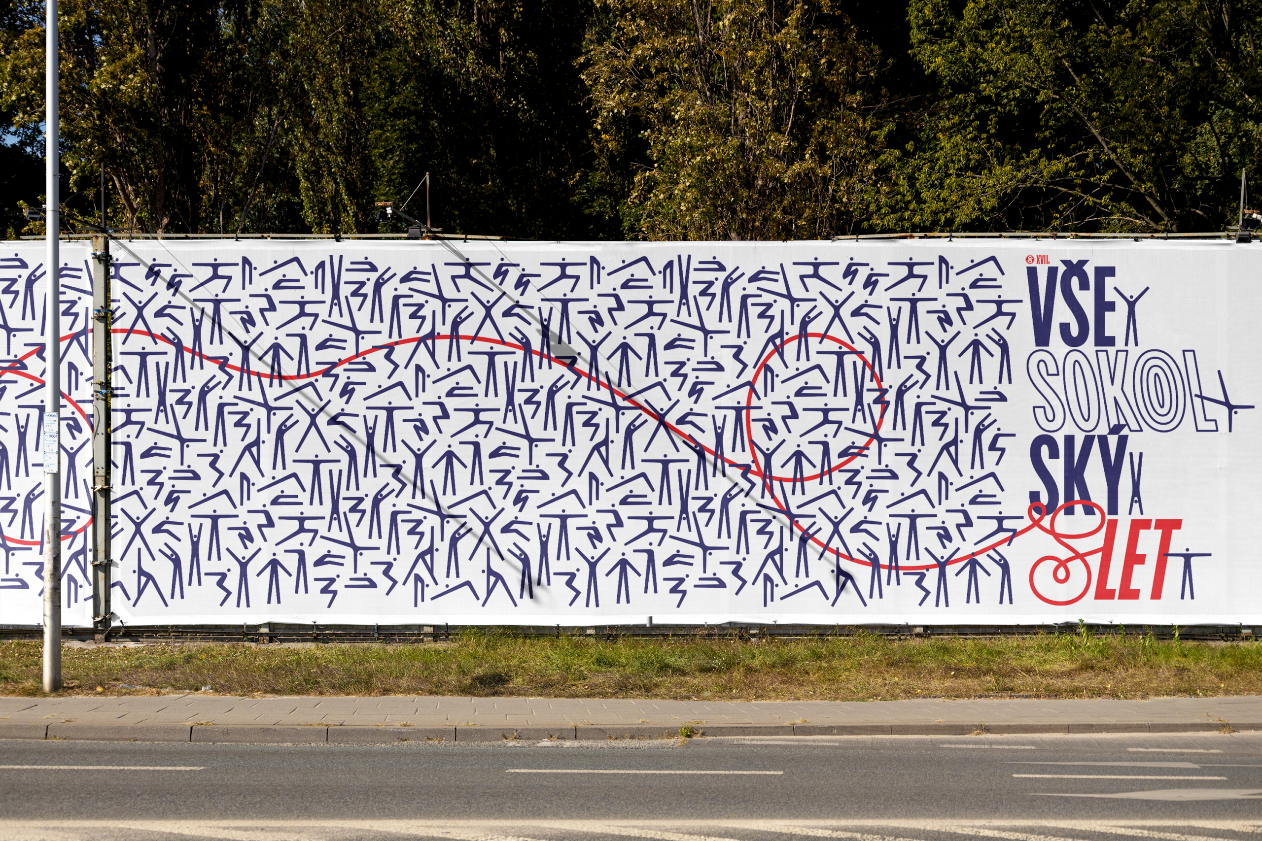
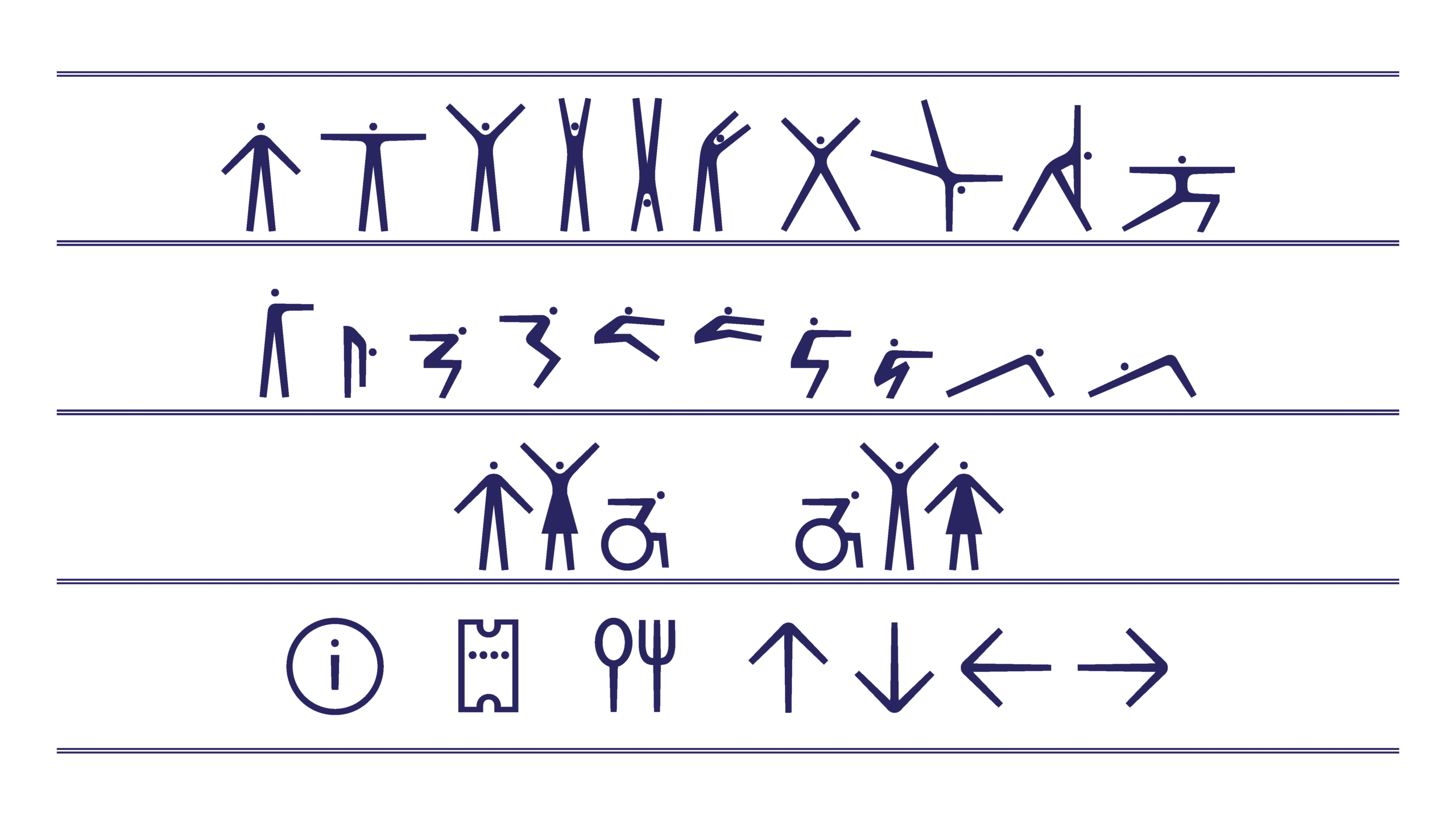
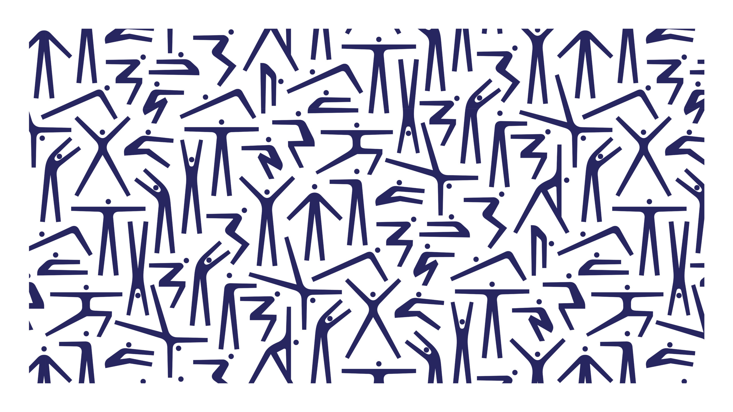
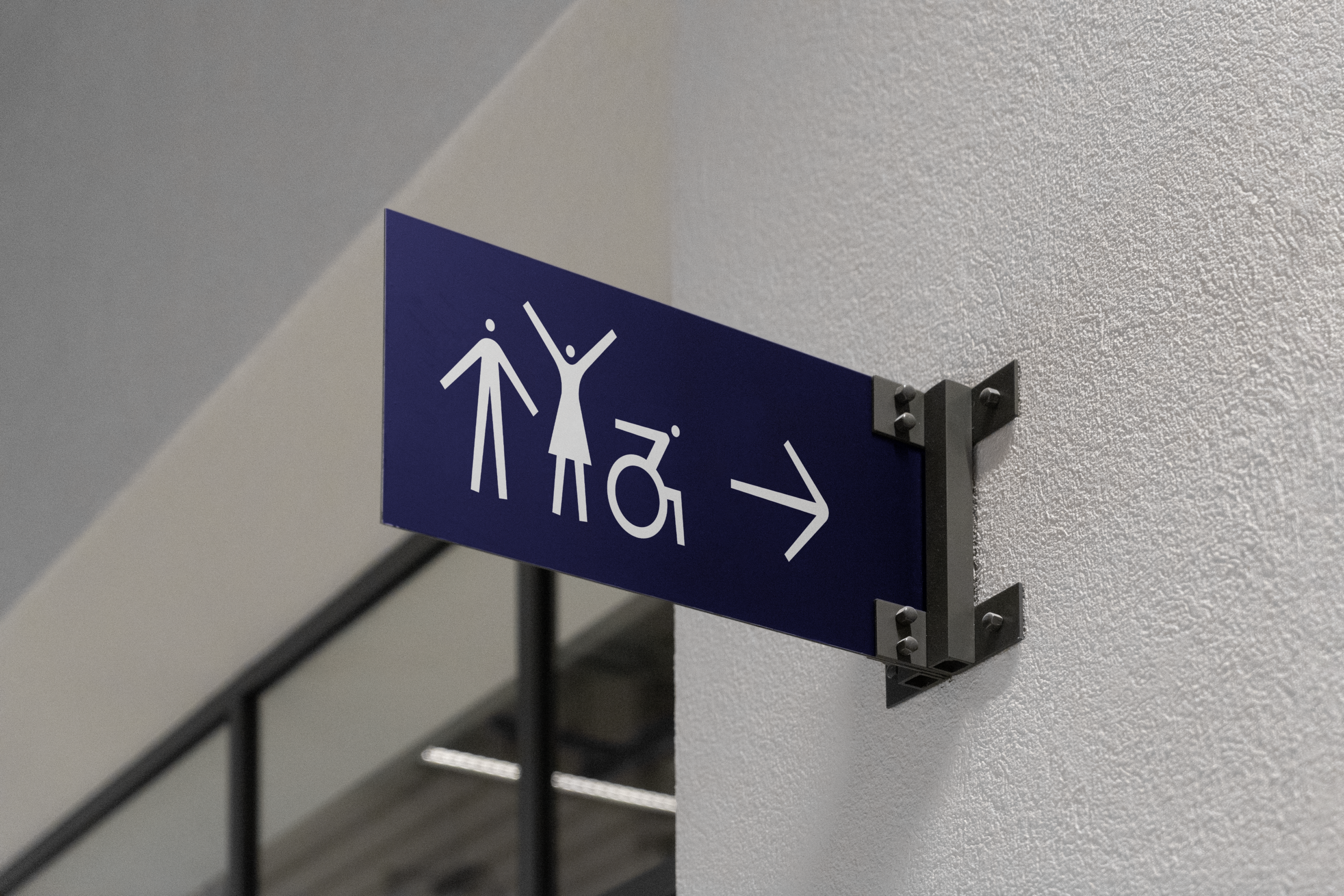
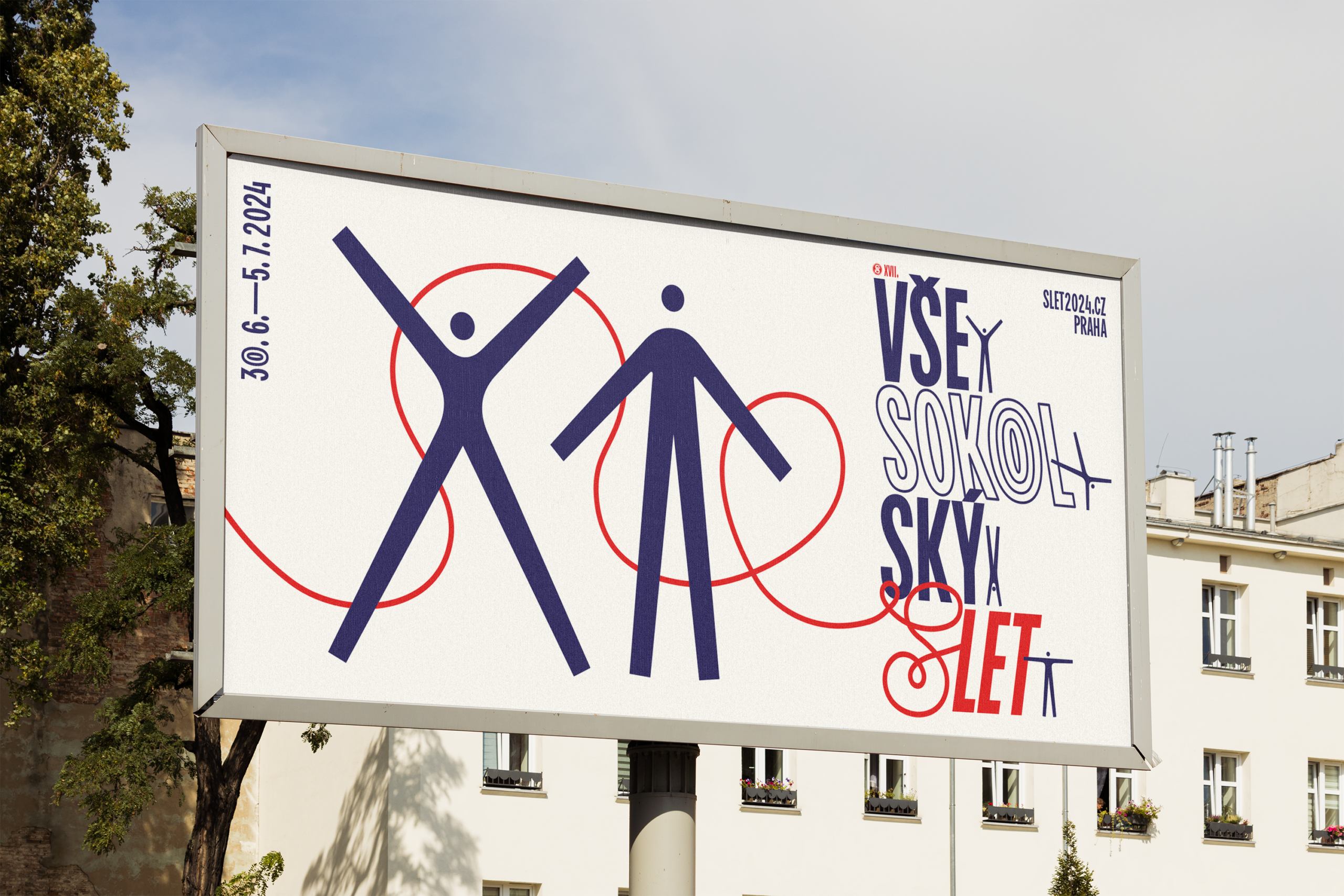
The main principle utilised is capturing movement through the use of fun pictograms and dynamic slanted type. The design sticks to the traditional flat colour scheme taken from the Czech national colours. The simplified icons of people in motion, inspired by the typeface typology with the addition of some rounded corners, can be used as standalone figures or combined to create a seamless pattern.
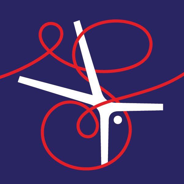
The written name serves as a sort of “full stop” or ornate logotype on horizontal banners. The curly S, inspired by the movement of a ribbon, navigates through the design and can be used as a logo in smaller applications.
Font used: BC Ludva
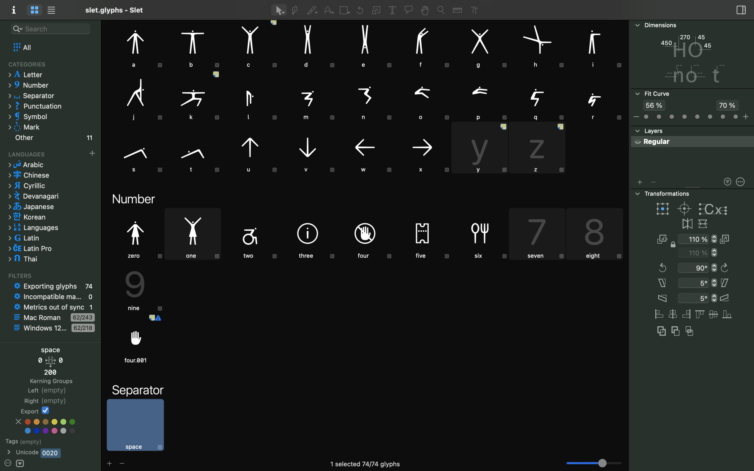
Made in: Glyphs, Illustrator, InDesign